

iPhone Duo Breakpoints: Is Your Website Ready for Apple's Foldable?
Apple announced the iPhone Duo, its first foldable iPhone, on 9 September 2026. Pre-orders open on 16 October and it goes on sale on 23 October. Closed, it's a 5.4-inch phone. Open, it's a 7.6-inch screen that's wider than it is tall. That means one visitor can see your page at two very different widths in a single visit.
This guide covers what changes, which breakpoints to test, and how to check your site with RankNibbler before launch day.
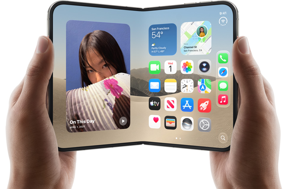
Why a Foldable Breaks "Phone vs Tablet" Layouts
Most sites still use device-based breakpoints: under 768px is a phone, 768px and up is a tablet, 1024px and up is a desktop. The iPhone Duo doesn't fit that model:
- Closed, the outer screen is wider and shorter than a regular iPhone.
- Open, the inner screen sits between phone and tablet sizes, so it's easy to end up with a stretched phone layout or a cramped tablet one.
- Split View lets people run two apps side by side on an iPhone for the first time, so Safari may only get part of the screen.
- Unfolding mid-visit resizes the viewport. That can shift the layout, lose the reader's scroll position, or break scripts that only measure the screen once.
Estimated iPhone Duo Viewport Sizes
Apple hasn't published CSS viewport sizes yet. The numbers below are estimates based on the reported resolutions (1398 × 2034 on the outer screen, 1878 × 2670 on the inner screen) at a 3× pixel ratio. Confirm them on a real device once it ships.
| Screen state | Approx. CSS width | What to check |
|---|---|---|
| Closed (outer screen) | ~466px | Navigation, hero text, sticky headers and bars |
| Open, rotated upright | ~626px | Stretched single-column layouts, oversized images |
| Open (wider than tall) | ~890px | Tablet layouts, multi-column grids, tables |
| Split View | Roughly half the open width | Your narrowest mobile layout |
How to Make Your Layout Foldable-Ready
- Set breakpoints from your content, not device names. Drag your browser window from 320px to 1000px and add a breakpoint wherever the layout starts to look wrong.
- Use fluid layouts.
clamp()for type and spacing andgrid-template-columns: repeat(auto-fit, minmax(…))adapt to any width without extra media queries. - Use container queries for cards, sidebars and product grids, so they respond to the space they actually have, including in Split View.
- Never let content get wider than the screen. Give images and embeds
max-width: 100%and put tables in a scrolling wrapper. - Don't sniff user agents. Choosing a layout because a device "is a phone" will get the Duo wrong in at least one state.
- Re-measure on resize. Anything that reads the viewport size should update when the screen changes, not just on page load.
What This Means for SEO
Google indexes your site mobile-first with a standard smartphone Googlebot, so it won't crawl your pages "as" an iPhone Duo. Foldables still affect your search performance:
- Core Web Vitals come from real users. If unfolding causes layout shift or a slow re-render, those visits count towards your CLS and INP field data.
- Keep the same content at every width. Text or links hidden at one breakpoint are content some visitors never see. If your smartphone layout hides them, Google won't index them either.
- Broken layouts cost clicks. A page that doesn't fit sends visitors straight back to the search results, and early foldable buyers are an audience most sites want to keep.
Check Your Site with RankNibbler
Before 23 October, run these free checks on your key page templates:
- SEO Checker: confirms every page has a viewport meta tag.
- Image Dimensions Checker: finds images missing
widthandheight, a common cause of layout shift when the screen size changes. - Website Speed Test: runs Google PageSpeed Insights on mobile settings and shows your Core Web Vitals.
- Lazy Loading Checker: checks that below-the-fold images aren't slowing down first load.
- Site Audit: crawls your whole site and flags every page with no viewport tag.
Last updated: September 2026